
If you want to boost productivity, influence quality, and crucial organizational changes, the Pareto chart system is a system you should try.
A Pareto chart is a system that highlights the frequency of defects and their growing impact.
It is a helpful tool that shows you where to focus your attention and effort to gain outstanding results.
This chart will help identify 20% changes that will bring remarkable results.
Why is a Pareto chart important?
Studies show that many people think they are not displaying their best work. This can happen when companies focus all their effort on wrong and weak projects.
With the Pareto chart, you get more things done without doing more work.

Companies that use it require fewer materials and staff and make huge profits.
With a chart like this, you have a clear view of any defects and problems that are causing financial problems or slowing you down.
And without it, you will continue to have errors and defects, waste materials, and money, and risk damaging your brand reputation.
Pareto charts are most frequently used in the economy, engineering, and manufacturing. Companies use them to determine what is important to their customers and ensure they are addressing their needs.
Now that you are familiar with the Pareto chart system, you are ready to learn how to use it to boost your efficiency and succeed.
If you want to learn the steps you can take to create your own Pareto chart, keep reading.
How to create a Pareto chart?
First, you want to gather all your data. This will help you create your very first diagram. If you have data in a software system, you can easily export it. Then you can decide whether to export it as a simple table or a table & and update it. Using a simple table works perfectly if you just need the core data.
Then you want to organize your data. Put it together in a format that helps you create a Pareto chart.
Some additional tools can also help you create Pareto charts.
Most people use Excel, but Google Sheets, LibreOffice, Numbers, or any spreadsheet applications will do just fine.
Once you gather enough data for a bar chart, you can calculate the cumulative contribution or percentage.
The cumulative line will always begin at the highest bar and extend upwards. And the cumulative percentage column adds context to the chart.
Adding a combo chart to the data is the easiest step.
You want to highlight all data, including titles, and when you highlight it, click Insert and select Chart.
The Combo chart is usually the default selection, but if not, select it from the Chart type dropdown.
The last step is adding the right Y-axis.
Just right-click any blue bars in the chart, click Series, and select Cumulative Percentage.
Once the menu opens, choose the Right axis under the Axis dropdown.

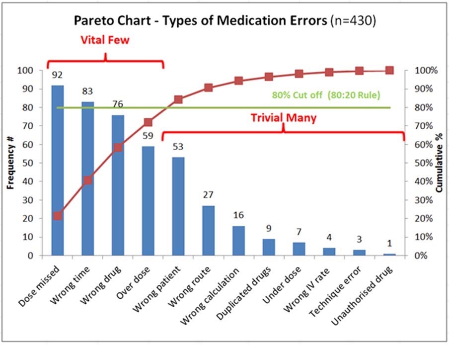
The blue bar chart highlights the most prevalent defects, and the red line determines how much of the problem can be fixed if you address significant problems.
For example, if a company focused its efforts on Bravo or Alpha problems, it would solve 80% of its issues.
Finally, store your Pareto diagram on monday.com or anywhere you want and move on to other areas that need improvement.
Final Words
Creating a Pareto chart will definitely help you focus your effort on beneficial projects and display your best work. You will also avoid failure and damaging your reputation.
You can begin solving your problems when you identify them and find ways to be productive.
With the power of Pareto charts, you can make your life easier and focus on what matters.